If you are a marketer, you already know the importance of a good landing page. A good landing page has the power to convert your web traffic into customers.
A good landing page is a critical element of a marketing campaign. If you are able to create good landing pages, it will open many doors of success for you.
Do you want to create a good landing page but don’t know how to start? If you are planning to learn how to create landing pages, this article is for you.
In this article, you will learn how to create a landing page and how to make it the most effective one easily.
What is a Landing Page?
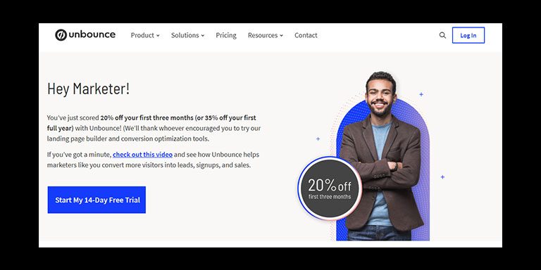
Before creating a landing page, having a clear view of the page is essential. So, the easy definition of a landing page is that it is a page on a website specifically designed with attractive visuals and bold messages to convert visitors into leads or customers.
If you have ever visited any website or discount article, I hope you have seen this attractive poster-type page. Actually, these are the landing pages.
The primary speciality of a landing page is that they are typically short, focused, and has a singular purpose.
Most of the time, they offer a CTA button. You can ask me if a website font page is similar to this and what the difference is.
So, let me tell you that the main difference between a landing page and a website is that landing pages are designed to minimize distractions and keep the visitor’s attention fixed on a single goal.
Why Do I Need a Landing Page?
After learning about what the landing page is, this is the time to know why you should need one.
I hope this part will encourage you to learn how to create a landing page because I will talk about the significant benefits you can get from a landing page.
First of all, landing pages are essential for business websites. Why is that?
Because they can effectively communicate and express their mission, values, products, and services to their audience with a landing page.
It is like pushing major and key information to a group of audience with minimum effort. So, is it only limited to businesses?
Not at all. You can also get the benefit of a landing page. So, while talking about the benefits, let me tell you that a well-designed landing page can inspire new visitors to become loyal customers.
Despite their importance, many businesses miss out on the full benefits of landing pages. As a result, they lose some valuable customers.
So, it is the main reason for learning how to create a good landing page. Whatever your business size or industry, it doesn’t matter; using landing pages with a clear offer can give you an extra boost and drive you towards success.
Landing pages are like helpful posters on the internet. They guide visitors to take a specific action, like buying a product or signing up for a service, etc., so it’s a great way to easily spread information to an audience.
So, if you want to attract more customers and drive more sales, you will definitely need to learn how to create a landing page.
How to Create a Landing Page?
Now, let’s come to the main part: creating a landing page. Here, I will discuss how to create a landing page by following six simple steps.
I have tried explaining the easiest and most effective way to make a landing page. So, without further delay, let’s look at the six main steps of creating a landing page.
#1 – Choosing a Landing Page Builder

I promise you that I will tell you the easiest way to create a landing page. I will start with landing page builders.
If you google and research how to create landing pages, you will find many different tools that can create landing pages.
If you are confused, let me tell you more about this. In the market, plenty of landing page builders like Unbounce and Instapage are available that are specially built to create landing pages.
In recent times, we have seen many landing page builder software that use advanced AI technologies to build landing pages.
Usually, they are easy to use, and a non-technical person can also operate some of the good landing page builders.
Usually, these tools have one thing in common: they all offer drag-and-drop editors. With this system, you can easily edit or create a landing page from your resources.
#2 – Template
If you’re not creative, building a landing page from scratch using landing page builders will give you a hard time.
So what’s the solution to this problem?
The solution is the template. You will find various templates designed for landing pages, and most of the time, landing page builders like Unbounce offer multiple types of templates.
You can use these templates, and after adding your information to the template, you can use them as landing pages. This will save you a lot of time.
Most of the time, professionals design these templates, so you will get attractive and audience-convincing templates.
#3 – Add Attractive Visuals
What makes a landing page attractive to an audience? The visuals make the landing page eye-catching to the audience.
With the landing page builder, you can add effects or easily create visually attractive elements.
However, most of the time, companies that sell products use product images or images that represent their service or products.
I suggest you always use attractive and eye-catching quality full images while creating landing pages.
If an audience member doesn’t find the visuals of your landing page, they won’t read your captions or text or pay attention to your information.
So, always try to collect or produce high-quality visuals while making a landing page. Always try to use HD-quality images, especially if you want to use images.
#4 – Add Convincing and Attractive Text
Is it enough only to put an attractive image on a landing page? Don’t you think it would be better to have a combination of beautiful pictures and magnetic text?
If you can put a convincing text with an attractive image, the combination will be a bomb. Don’t be afraid; this bomb means it will attract more customers.
So, putting short and clear messages on a landing page is very important. This brief and clear text will deliver your messages to your audience correctly, and it will lead to an increase in conversion.
While creating landing pages, always focus on writing attractive and convincing messages.
Now, in this section, I will give you a suggestion. First, while writing the text for the landing page, describe your service or product properly and clearly.
Then it would help if you told them about its benefits and why they need it. That is it. All you need to do is try this text minimum as clear and convincing as possible.
#5 – Include Social Proof
How do you gain trust with your landing page? Yeah, you have used a landing page creator that uses attractive images and text.
What’s more? Do you think people will believe you because of your beautiful image and text? What if they count this as a scam?
So, to gain your audience’s trust, you need to add social proof. So why is this social proof necessary?
Social proof is essential for building trust with potential customers in online marketing.
From my past experience, I am sure you need clarification about social proof. I will talk more about social proof in this section to remove your confusion.
First of all, what is social proof?
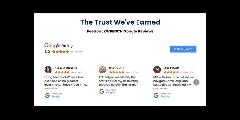
Social proof includes testimonials, case studies, customer ratings and reviews, influencer endorsements, certifications, brand/client logos, subscriber counts, social shares counts, and storytelling.
The list is pretty long, and I think you are now starting to get ideas about what actual social proof looks like.

In the picture below, I have put an example of social proof on a landing page to give you a clearer view.
From a study, we have learned that showing social proofs on landing pages increases 91% of consumers’ trust.
So here’s a little trick about social proof. The trick is to use a photo thumbnail to make the evidence more legit. This trick will enhance the effectiveness of your social proof.
#6 – Add Branding Elements
The most crucial part is adding a branding element to your landing page. The landing page is like a visiting card for your online business.
So, it would help if you used the proper setup to make your branding elements shine on your landing page.
What to do about this? How can you use proper branding elements on your landing page? Don’t worry.
This article is about how to create a landing page easily, so here, you will also learn how to use branding elements.
So, to do that, first, you need to ensure that the colours on the landing page match your brand colours precisely for consistency and coherence.
Then, you need to adjust the text colour and fonts to align with your brand’s style. Why this? Because it will create a seamless experience for visitors.
Now, let me tell you another important thing about branding elements.
The branding element is necessary because consistent branding across your website and landing pages helps strengthen brand recognition and trust among potential customers. So, always keep a close eye on this while creating landing pages.
Things You Need to Consider Before Creating a Landing Page
In this content’s upper section, we discussed the basic rules for creating a landing page. If you follow those steps, you can create a landing page easily.
But what makes a landing page effective? How can you create a landing page with a 100% success rate?
Do you want to know the secrets big brands use while creating their landing pages? If you want to know this and master the art of creating landing pages, this part is for you.
Let’s see some additional things you need to consider while creating a landing page.
#1 – Have a Clear Goal
While creating a landing page, always start with a fresh mind. You need to think about what you want to do with this landing page; what do you want your customers to do after seeing the landing page?
You must ensure that your landing page’s content and design align with the desired action you want visitors to take.
It’s crucial because if you want to influence your customers to buy something through the landing page but you design the page to collect emails, something else will be needed.
So, always consider the value of each potential action and design your page according to your business objectives.
I suggest that you develop your landing page according to your goal or business changes.
#2 – Prioritize the Call to Action (CTA)
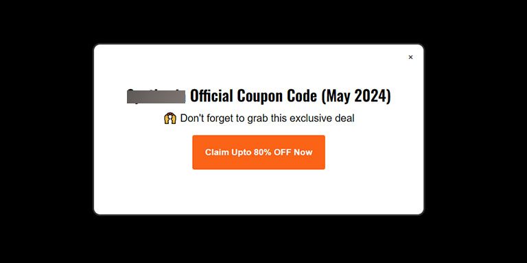
Now, every landing page has something in common: the CTA button. In the picture down below, I have shown you an example of what a CTA button looks like.

This button plays a vital role in a landing page. So, it would help if you experimented with different CTA placements, sizes, colours, and wording to determine the most effective combination.
The main rule of a CTA button is that you need to use action-oriented language that clearly expresses the benefit or outcome of clicking the CTA button.
Now, I will share a secret trick. The trick is to incorporate urgency or scarcity elements on the CAT button.
Now you can ask what the benefit of this will be. The benefit of this is that it encourages immediate action. So, to create urgency, you can use limited-time offers or countdown timers.
Lastly, you need to make sure that the CTA button is prominently displayed above the landing page and remains visible as visitors scroll down the page.
#3 – Design a User-Friendly Landing Page
You already know how to design a landing page. But it’s just the technical part. Creating a landing page needs some artistic knowledge.
So, first of all, you need to create a user-friendly landing page. This means that you should put only a little information in it because it will confuse your audience.
Now we know how smartphone users are increasing, so optimizing your landing page for mobile devices is essential.
As a result, you will get all the audience who access it from smartphones or tablets. The next thing you need to focus on is to minimize distractions.
It’s essential to make it easy for the audience to navigate the landing page. You can do that by removing unnecessary links, buttons, or form fields.
Now, a significant rule of design is to use whitespace effectively to enhance readability and create a clean, organized layout.
So I will suggest you always focus on that, and if you are not that expert, try YouTube or follow some significant brands’ landing pages to gather this type of idea.
If you want to do something different in design, you can implement interactive elements, such as animations or interactive forms, to engage users and encourage interaction.
#4 – Set Up Lead Generation
One of the primary purposes of landing pages is lead generation. So, if you underestimate this part while creating a landing page, you will miss a big part.
The lead generation form is a critical component of a successful landing page. This significant element serves as the gateway to capturing valuable information from visitors.
There are plenty of software and tools like MailerLite for this work. Also, if you want, you can add some email tracking or CRM tools with this.
However, you should always design your lead generation approach based on your specific business goals. If you do this, you will see significant improvements in results.
#5 – Boost Landing Page SEO
If you want to make the best and most effective use of your landing page, then you need to optimize your landing pages for search engines.
Landing pages get their traffic from emails or ads, but getting search engine traffic can take your conversions to the next level. So, what do you need to do to optimize your landing page?
There are plenty of tools like MailerLite available in the market for SEO optimization. These tools can easily help you to optimize your landing page.
Additional Tips for Creating Landing Page
Now, if you have made it this far, congratulations! You can now start your journey of creating landing pages.
But for coming this far, I will share some additional tips to make your landing page more attractive. Let’s see what will make your landing page a step ahead of your competitors.
Optimize Page Speed
Optimizing the page speed of your landing page for a better user experience is essential. You can easily analyze page speed using tools like Google PageSpeed Insights or GTmetrix.
So what if you find that your page speed is low?
You can easily solve this problem, and it isn’t a big deal for a landing page. To speed up your landing page, you need to optimize images, enable browser caching, and consider using a content delivery network (CDN).
Lastly, always go for a good hosting service like Hostinger or Cloudways. Because it is essential to ensure that your hosting providers can provide you with sufficient resources to handle traffic efficiently.
Learn Copywriting or Employ AI Writers
I have mentioned several times in this content how vital the text messages are for a landing page. I suggest you invest time in learning copywriting for landing pages.
There are plenty of courses out there online that will teach you how to write exciting copies for landing pages.
But what if you need more time or patience to learn this? You can use AI to help you out of this problem.
There are plenty of AI writers like Rytr that can easily give you attractive copies of texts for your landing page.
F-shaped Content/Page Structure
Geometry plays a very crucial part in the design. Artists always try different patterns and geometry to manipulate the human brain.
The primary purpose of this geometry is to guide viewers’ eyes easily to the subject of a picture or landing page.
For example, photographers use frames between frames or the rule of third geometry to create a good picture.
So, while designing the landing page, you also need to focus on geometry. So here is a tip for you: Always organize content in an F-shaped reading pattern.
It will easily guide viewers’ attention towards your actual message and your CTA button.
You need to place important details along the top and left side of the page. Because this attracts viewers’ attention easily, your conversion rate will increase.
Create a Sense of Urgency
The key trick of a landing page is to create a sense of urgency among the audience. It’s an ancient and effective technique to increase conversion rates.
So, to do that, you need to put time-sensitive elements such as limited-time offers, countdown timers, or flash sales.
Final Verdict
Now, I have come to the end of this blog post. I hope that you have gained enough knowledge about creating landing pages from this content.
I have tried to make the landing page creation process as easy as possible. If you have any questions about landing page creation or want to know more, you can leave a comment in the comment section.

